Tuesday, 22 March 2011

Research on Soap Opera Posters.


Research on posters-

There are some example of posters I found created from real media products – Eastenders,
Coronation Street
and Hollyoaks.


They do not seem to have any formal conventions because posters seem to be rare with soaps because they are known for being on the cover of TV listings magazines, where soaps advertise upcoming storylines and issues.

My final TV Listings Magazine.

This is my final TV listings magazine cover.


I think I have successfully used all the conventions that I found with in my research which can be found on my blog on the post called ‘Research on TV listing magazines’ published on the 22nd of March.

Photos for TV Listings Magazine.


These images are from the affair scene, which I have used on my front cover of my TV Listings Magazine. I decided that was going to uses these characters and storyline because it think they appeal to a mass audience; as teenagers, the middle aged and the elderly will be interested in them.

I chose to have the characters in a particular position which mirrored those in existing media products. For example I wanted all the characters in a straight position so that I was able to move them about into a triangle position on my front cover. I believe that this helps to give the audience some narrative as they will be able to realise a love triangle.
I decided to use this image of teenagers partying as documentary type on BBC3, it seems that the channel has consisting documentaries about teenagers therefore I thought I would realistic to developed their use of teenagers on my own front cover.


I used this image because of the use of mise-en-scene; suit. Therefore I thought it would again be realistic to develop an idea of an award ceremony. They are pretty popular with audiences; again this would appeal to a magazine demographic.

I used this to help to mirror the idea of ‘Loose Women’. This type of TV is popular with women and therefore I thought I would be a good idea to include this because of the similarities in target audiences. For the photograph all the ladies are wearing causal clothing, which helps when appealing to the audience but I also think that by having all the ladies facing one way with their arms cross connotes humour, girly and talk show to the audience.

The Planning of my TV Listings Magazine.

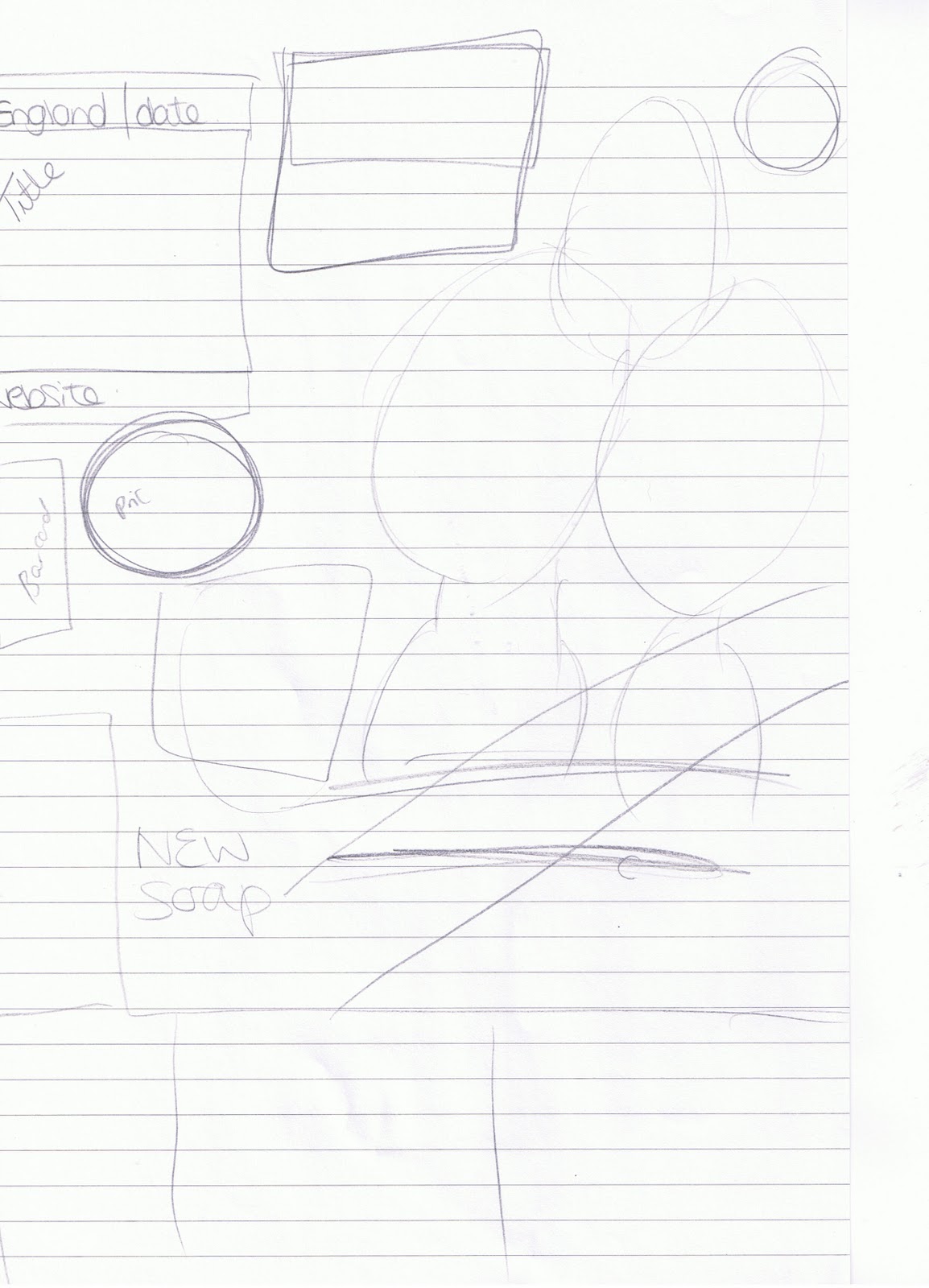
Planning of my TV Listings Magazine-

I decided that it would be a good idea to plan my magazine to ensure that I included all the correct conventions for this genre. I planned my TV Listings magazine twice so that I was able to visual see the aspects of my magazine. I believe that planning my cover before creating it in Photoshop was an advantage for me as I was able to get all my ideas down on paper so that I had a clear indication of what I was going to do when I was in front of the computer. This also allowed to me compare with other existing magazines in a successful way. It also meant I was able to adapt and change my magazines and ideas in a realistic way, so that when I was actually creating my TV listings magazine on the computer I knew exactly what I wanted to do.


These are my plans of my TV listing magazine- here I have created the initial ideas for my font cover when I have included all the conventions of this genre. From here I was able to use these when creating the cover in Photoshop.

Research on TV Listings Magazines.

To be able to create a successful media TV listings magazine, I had to research other existing magazines so I was able to educate myself on the conventions of these typical media products. Therefore I had to look at every aspect of these particular magazines and find similarities and difference between them.

Firstly I explored the internet for different existing TV listings magazines so I was able to analyse them thoroughly. Here are some of the most popular TV listing magazines available in the market today:-
·         What’s on TV
·         TV Easy
·         TV choice
·         TV Quick
·         TV Mag


I took a few font covers for the same magazines to see how they varied within themselves. Even from just looking at theses magazine I was able to indentfy the clear conventions and similarites they all share. For example:-
·         They all have blue background
·         They all mainly have title of the magazine in the left hand top corner which is very eyecatching to the target audience/
·         Colour photographs which fill up the magazine- this helps to attract the target audience as they are familiar with the characters faces and what programme they are in.
·         They all have big headlines and straplines
·         All contain pugs
·         The price stand outs
·         Very colourful (attract the target audiences eye
·         Mass audiences
·         Coverlines
·         Date, region and issue number
·         Barcode
·         Masthead
·         Taglines

Therefore by researching all of these magazines I am able to use the conventions when creating my own TV listings magazines. I am able to create a check list so that I ensure all the conventions of this particular genre of magazine in included in my own one for my soap so that it can be a successful media product.


Final Soap Opera Trailer

After audience feedback through my questionnaire analysis, I was able to adapt and improve my soap trailer. Here is my final media product.
Sunday, 6 March 2011

Questionnaire Analysis


Questionnaire Analysis.


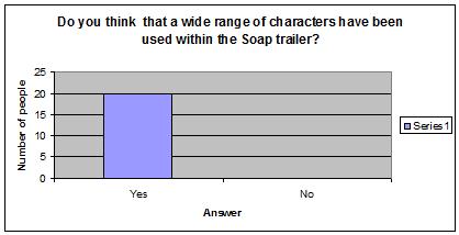
Question one-


For this question I asked people if they thought I had used a wide range of characters in my soap trailer. They all agreed that I had, as I have used a variety which consists of teenagers, middle aged and elderly. Therefore this mirrors the conventions within a soap opera.
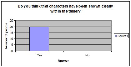
Question two-


All the people that answered my questionnaire agreed that all the characters have been shown clearly. Therefore I believe that stereotypes have been portrayed accurately.

Question three-


This question shows that the people who answered my questioned believed that I have used a wide range of camera shots. I used all the typical realistic shots used in soaps like close up, mid shots and shot reverse shot. However I also used panning and zooming which gives the trailer a more sophisticated look.

Question four- 


Everybody agreed that my music suited my trailer, as research showed that most trailers where around 30-50 seconds, I needed to mirror this. Therefore I used quick snappy show and I needed my music to be exactly the same. I used different tracks and put them together in order to help me accomplish the fast snappy track I needed.

Question Five-


It was agreed my trailer had continuity, because of the fast snappy cuts and the music completing this.

Question six-


All 20 people agreed that mise-en-scene fitted the stereotypes which is something that is important when creating a trailer for a soap. As the genre is created by stereotypes within society.  

Question seven-


For this analysis of my questionnaire I found out that majority of people said I should uses Evaluation activity three- within my soap trailer. Therefore I will be using this information when going back to editing to see how they can used in successful ways.

8. Do you think there is anything that I can improve within my trailer?
Out of twenty people, five suggested that it maybe a good idea to add some transitions between the different storylines of the characters, which will help break them up a little bit more. Also there was a suggestion about having my music at the end concluding rather than fading out.


9. What do you think is successful about my trailer?From the questionnaire I have found out that my quick snappy editing cuts deem successful, as it gives my trailer a fast pace which helps the trailer make sense. People commented on how they liked the music as it was appropriate for the atmosphere for the trailer and made it lively. Someone also said that the music complemented my fast cuts and also the different range of camera shots used which makes the trailer seem like a stereotypical Soap Opera trailer.